The W3C is due to release the newest version of the Web Content Accessibility Guidelines (WCAG), Version 2.2, at the end of August 2023. This update to the guidelines has been in the pipeline for a while so we are excited to see this close to release!
Our work with Joseph Rowntree Housing Trust is an example of a platform where we were able to display our commitment to accessibility. We intend to leverage our previous practices in WCAG 2.1 to deliver top quality accessibility services that reach the requirements of the new standards.

This post will be going into slightly more detail on the result of the new standards for developers, owners and website users.
In a future blog post we’ll cover what the WCAGs are and why they are important, but for the purpose of this post the W3C site provides an insightful overview.
New criteria
WCAG 2.2 is not a complete rewrite, but rather an iteration on version 2.1, which is already well established. One obsolete criterion has been removed (4.1.1 Parsing. More information is in the WCAG 2 FAQ, 4.1.1 Parsing.), and 9 new criteria have been added:
Guideline 2.4 Navigable
This section focuses on helping users to find content and determine where they are within the site.
2.4.11 Focus Not Obscured (Minimum) (AA)
The essence of this is ensuring that when someone tabs to an element on a page, at least part of that element should be visible and have a visible focus state.
An example of this can be observed in the situation when a site has a ‘sticky’ footer, enabling it to overlap content that is otherwise deemed as visible to a browser. Tabbing to an element behind that would fail this check: it needs to be visually obvious which is the currently focused element. In this case the element would need to be scrolled from under the footer.
WCAG success criteria:
"When a user interface component receives keyboard focus, the component is not entirely hidden due to author-created content."
2.4.12 Focus Not Obscured (Enhanced) (AAA)
Within this sector, the previous criterion is built upon but for Level AAA; no part of the focus indicator can be obscured when the element has focus.
WCAG success criteria:
"When a user interface component receives keyboard focus, no part of the component is hidden by author-created content."
2.4.13 Focus Appearance (AAA)
Here, the important thing is the visibility of the focus indicator. The intention of this is to ensure that the contrast between the foreground and background is sufficient when the focus indicator is visible.
The WCAG success criteria appears as follows:
"When the keyboard focus indicator is visible, an area of the focus indicator meets all the following:
- It is at least as large as the area of a 2 CSS pixel thick perimeter of the unfocused component or sub-component
- It must have a contrast ratio of at least 3:1 between the same pixels in the focused and unfocused states"
Guideline 2.5 Input Modalities
This section focuses on making it easier for people to use the functionality through various different inputs, rather than solely using a mouse.
2.5.7 Dragging Movements (AA)
Anything that requires dragging to interact (e.g. slide to open, or drag to reorder) needs to have an alternative way of performing the same function. An example of this could include buttons to move an item up/down rather than a slider.
WCAG success criteria:
"All functionality that uses a dragging movement for operation can be achieved by a single pointer without dragging, unless dragging is essential or the functionality is determined by the user agent and not modified by the author."
2.5.8 Target Size (Minimum) (AA)
This ensures that any interactive element (button, link, etc) is at least 24x24px in size, simplifying tasks in ways such as if a person with tremor would need to interact with them.
WCAG success criteria:
"The size of the target for pointer inputs is at least 24 by 24 CSS pixels"
Guideline 3.2 Predictable
3.2.6 Consistent Help (A)
It is critical to keep consistency and predictability to reduce cognitive load. This benefits everyone and not just people with disorders such as dyslexia.
If there are features such as a ‘live chat’ button, or contact details, these should be located in the same place on every page across the site in order to make its position more obvious.
WCAG success criteria:
"If a web page contains any of the following help mechanisms, and those mechanisms are repeated on multiple web pages within a set of web pages, they occur in the same relative order to other page content, unless a change is initiated by the user, such as:
- Human contact details;
- Human contact mechanism;
- Self-help option;
- A fully automated contact mechanism."
Guideline 3.3 Input Assistance
The Input Assistance section has been implemented in order to help users correct any mistakes that they may have made, as well as to avoid them in the first place.
3.3.7 Redundant Entry (A)
Certain people may have difficulty remembering the data that they previously entered. For journeys that require the information from a previous step, e.g. a membership number or email address, users should not have to re-enter this. Either pre-filling the field, or allowing the user to select without re-typing, will be a sufficient feature to pass this.
The exception of this, for where it would be necessary to repeat information, is data such as passwords, or anything particularly sensitive.
WCAG success criteria
"Information previously entered by or provided to the user that is required to be entered again in the same process is either:
- auto-populated, or
- available for the user to select."
3.3.8 Accessible Authentication (Minimum) (AA)
People with cognitive difficulties may find difficulty in remembering passwords, or solving complex maths problems. Therefore, providing alternatives such as allowing copy/paste into a password field, or the use of a password manager will simplify this process for users.
3.3.9 Accessible Authentication (Enhanced) (AAA)
The enhanced criterion for Accessible Authentication is to ensure that a user doesn’t have to recognise patterns or images (e.g. a CAPTCHA) in order to log in. Furthermore, people with cognitive difficulties are likely to struggle to recognise patterns, shape or to solve puzzles.
What we’re doing to get ready
At Zoocha, we have dozens of clients spanning a number of different sectors. Public sector websites are monitored by Government Digital Service as part of the Public Sector Bodies (Websites and Mobile Applications) (No.2) Accessibility Regulations 2018.
Consequently, all public sites will be required to be WCAG2.2 compliant, although with the standards still yet to be finalised, this won’t likely take place until early 2024 (https://accessibility.blog.gov.uk/2022/12/09/some-changes-to-the-public-sector-digital-accessibility-regulations/)
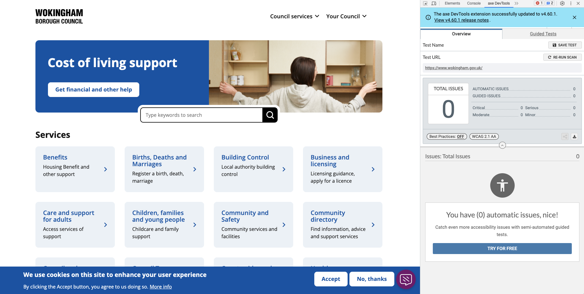
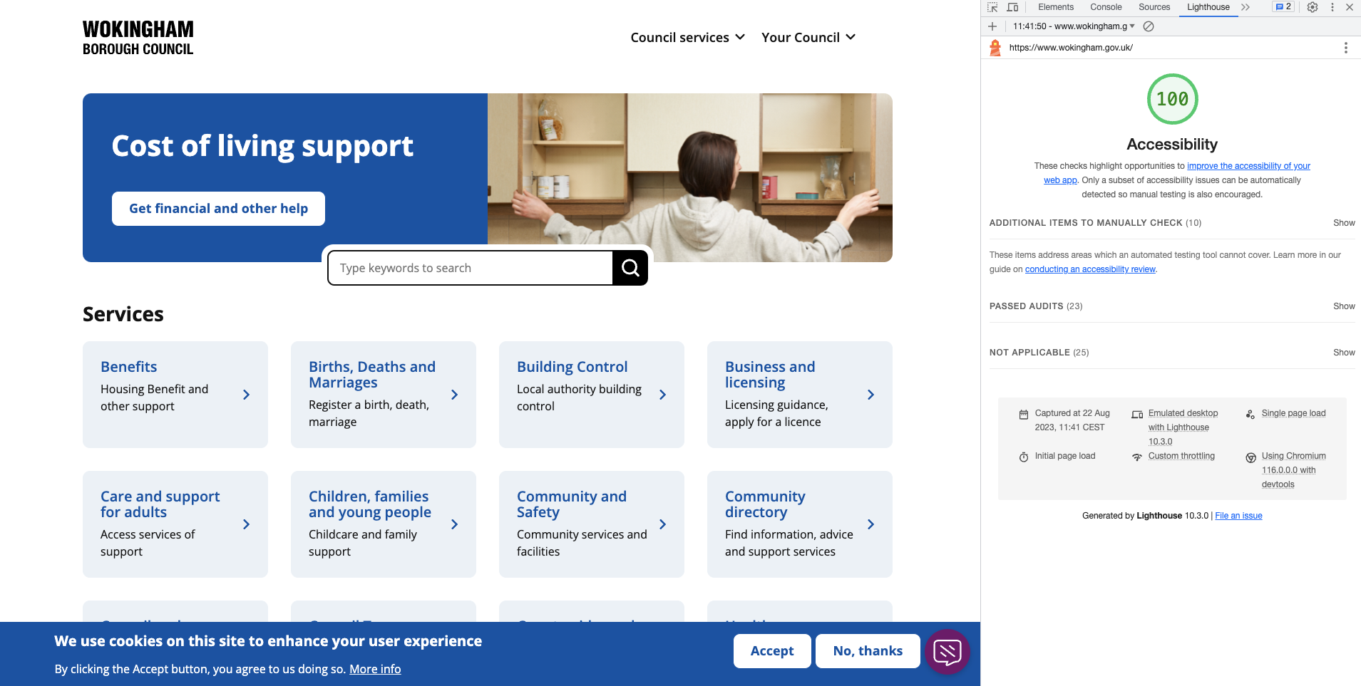
While Zoocha have started to strive towards our goal of reaching WCAG2.2 standards consistently, we currently utilise a number of testing softwares in order to ensure that all of our sites are reaching WCAG2.1 standards as a baseline.
Two of the softwares that are extremely reliable, which can be found below in reference to our work on the Wokingham Borough Council platform, are Axe and Lighthouse:


We are currently auditing the sites we build against the changes introduced in WCAG2.2, and providing a summary of recommendations to our clients with any remedial work we find. This is then prioritised into our ongoing development sprints, meaning many will already be compliant by the time the guidelines are published.
We aim for all of our sites to meet the new guidelines by the time the GDS monitoring team start to test for WCAG2.2. Fortunately, for sites that are already meeting the WCAG2.1 AA guidelines, there is not much effort in pushing these to match WCAG2.2!


