Strengthening Collaboration Between Design & Front End
Introduction
At Zoocha, we pride ourselves on being team players, with the goal of working together as one unit rather than as separate departments.
Two areas that are particularly tightly linked are the UX & Design and Front End. In order to work efficiently to deliver high-quality, user centred and accessible solutions, both teams must work collaboratively and rely on each other.
Room for improvement
Through Agile Retrospectives and internal feedback, we realised that in order to achieve the results we wanted, improving collaboration between UX & Design and Front End would be key to our success as a team.
We recently shared how Zoocha improved and expanded on our own Storybook Starter theme. In order to keep this front end theme relevant and up to date, constant maintenance has been necessary. However, in order to carry out this maintenance, collaboration with the design team has been required to move development forward.
While this is just one example, effective collaboration between the UX & Design and Front End team has been essential to various areas of our delivery process, resolving gaps between design tools such as Figma and front end development.
Core areas we focused on for improvement included:
- Setting up a prototype/design file that better suits developer needs.
- Approaching typography more efficiently and standardising terminology.
- How the grid should be set, as well as which breakpoint should be used.
- How spacing should be applied to elements and inspected.
- Creating a naming convention for elements/components to ensure reusability and maintenance.
Reaching our goal
Communication was key to the resolution of these actions in order to establish a shared vision of success.
Our UX & Design and Front End teams both had separate, pre-established, regular meetings, in which they could showcase any updates within topics such as interesting new side projects, softwares, and blockers. However, it soon became evident that cross-team communication would be beneficial. With a shared goal in mind, a collaborative catch up would allow us to avoid any duplications, set secure standards, and take advantage of a wider range of skills. These catch ups now include both the Front End team and the UX & Design team, allowing for a more effective brainstorming, and innovative solutions.
Our approach
We started by using a Miro Board in a similar way to how we run our internal project retrospectives. By doing this, each individual had a chance to share their thoughts across:
- What was going well/what has improved?
- What still needed to be improved?
- What they wished they we had access to?
- Actions to help them go forwards.

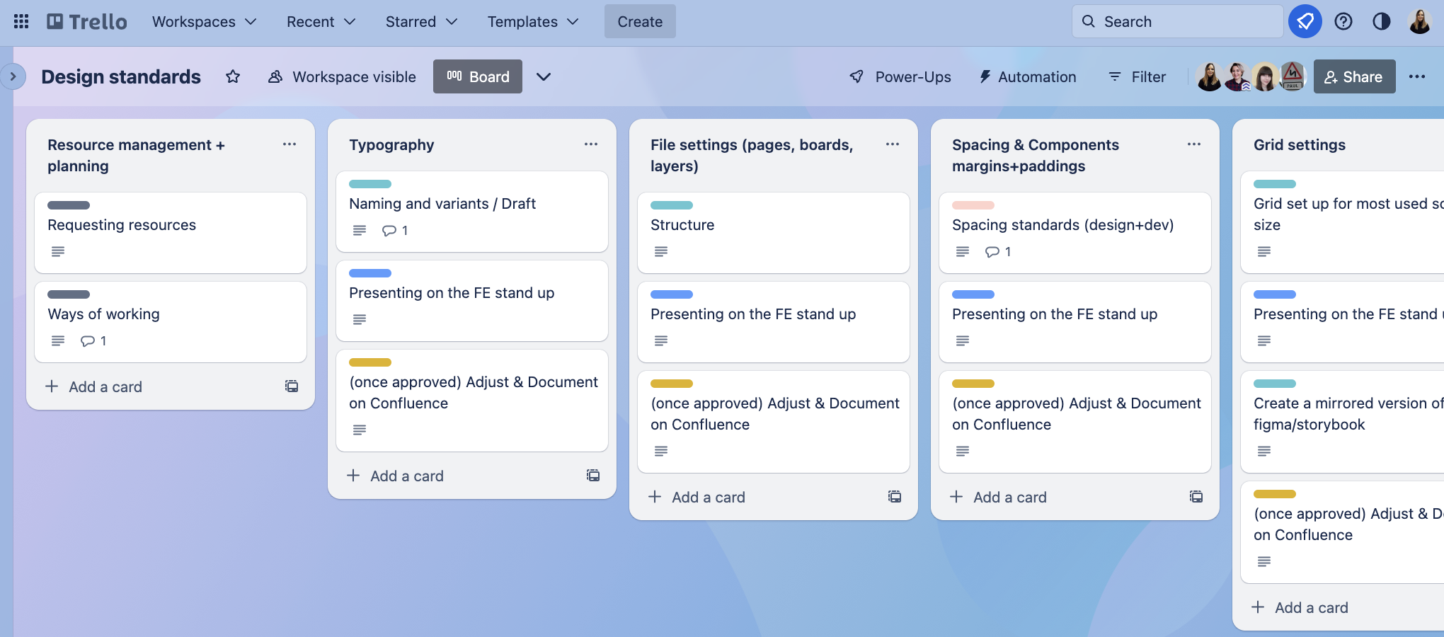
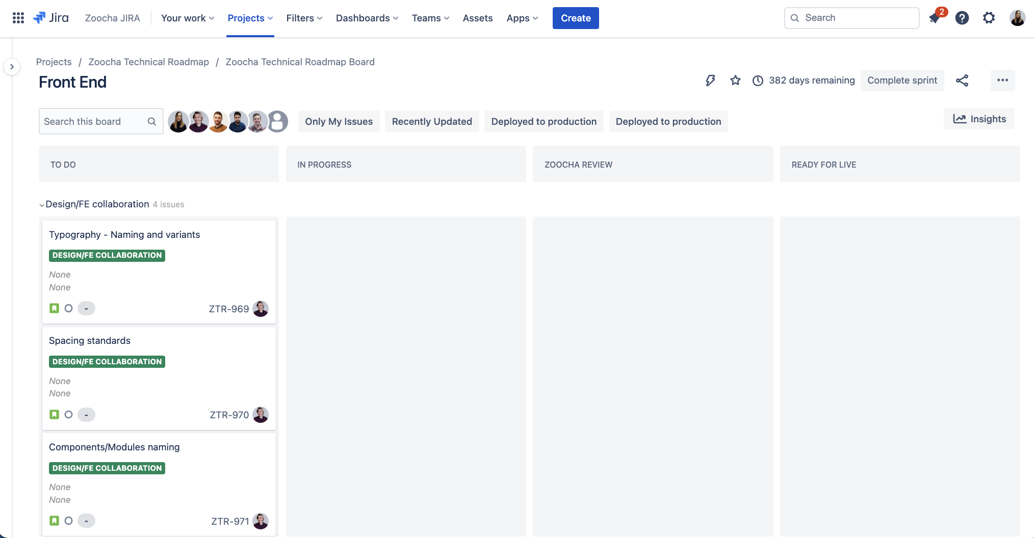
By leveraging our collaborative action points, we were then able to create a Trello board, where we linked each of our tasks to our Internal Jira Roadmap board:


Through fortnightly, collaborative meetings to gather feedback on our objectives and how they could be best achieved, as well as making improvements via open-to-edit Jira tickets, we have improved our processes and maintained the retro as a standard part of our approach.
In conclusion
While we are always keen to adapt to new softwares and technologies, we aim for a set of design standards that can improve both the quality and delivery of our product, resulting in more consistency, less bugs and a happier team.
We stand by the belief that design standards and systems are not set in stone, but are organically developed across time and research, creating an on-going cross team project between UX & Design and Front End.
