As part of the front end team, I was quite excited to be introduced into the project on the sites for FCA. We knew the sites would all be running on the same Drupal pre base using several modules to ensure smooth operation with different domains.
What we needed to focus on was dealing with five independent themes including a theme folder which was to be the basis for three separate sites. These three sites have very similar structures and the difference in the appearance between them is minimal. So just to get stuck into the project here are the sites:
- FCAPP - FCA Practitioner Panels (Green)
- FCAMPP - FCA Market Practitioner Panels (Purple)
- FCASBPP - FCA Small Business Practitioner Panels (Blue)
Due to such heavy similarities (the only real changes were in a few pages and the colours used) we had a folder structure which would use most of the same styling. Using LESS meant we could have a setup where, when compiling with grunt, we would end up with three different CSS files for each site:
style-pp.css
style-mpp.css
style-sbpp.css
So all we had to do to make changes to one particular site was edit its independent LESS file which was included only in the compile chain for it's resulting CSS (which was then injected into the sites dependent on their domains), pretty cool I say! Here is the relevant snippet of the gruntfile:
 less: {
 development: {
  options: {
   compress: false,
   yuicompress: false,
   optimization: 2,
   sourceMap: true,
   sourceMapFileInline: true
  },
  files: {
   // target.css file: source.less file
   "css/pp-style.css": "less/fcapp.less",
   "css/sbp-style.css": "less/fcasbp.less",
   "css/mp-style.css": "less/fcamp.less"
  }
 }
},

watch: {
 styles: {
  // Which files to watch (all .less files recursively in the less directory)
  files: ['less/**/*.less'],
  tasks: ['less'],
  options: {
   nospawn: true
  }
 }
}
The downside to this was that we had to use a lot of very similar filenames for each template and a lot of the pre was very similar in each file. As well as this, background images proved to become a bit of a hassle because, of course, we had to have different files for each site so editing these seemed to take a lot of care and ended up looking something like this:
 // Home
&.page-fcapp---homepage-content {
 #content { background: url('@{images}pp/pp_home.jpg') 0 -200px no-repeat; }
}
// Background
&.page-node-374 {
 #content { background: url('@{images}pp/pp_background.jpg') 0 0 no-repeat; }
}
// Contact
&.page-node-386 {
 #content { background: url('@{images}pp/pp_contact_us.jpg') 0 -526px no-repeat; }
}
// Members
&.page-fcapp---members {
 #content { background: url('@{images}pp/panelmembers_heroimg.jpg') 0 0 no-repeat; }
}
...
...in three different files!
FCASF- FCA Small Firms (Beta)
This theme was considered largely different from the rest. It was almost a new project in itself. Initially, we received two design documents. One was for the components used globally across the site and the other for the templates for each type of page. There was a lot to consider, the style, functionality, user journey's and general feel.
The project started off well where work on the build was bouncing back and forth smoothly between the back-end and front-end devs. Using Acquia as our hosting service had quite a few advantages, one being that we were able to quickly set up drush aliases for syncing the database, so we could almost keep up to date with each other at all times with a simple command.
As this project continued, a lot of the proposed designs were to be dismissed as unnecessary and a few of the template designs began to change including the fact that this would be launched as a BETA site leaving room for improvement for the users and how they access and find the information that they need.
We essentially had three user journey's to consider:
- A journey for those who know which Firm Sector they are affiliated with. This would take them through to contextually filtered pages.
- A basic general information journey. Basic Pages with general information which were simple taxonomy pages.
- And later on a user journey to contextually filtered pages through the main menu. This would have a similar structure to the first, only that they would be able to further chose their Firm Sector
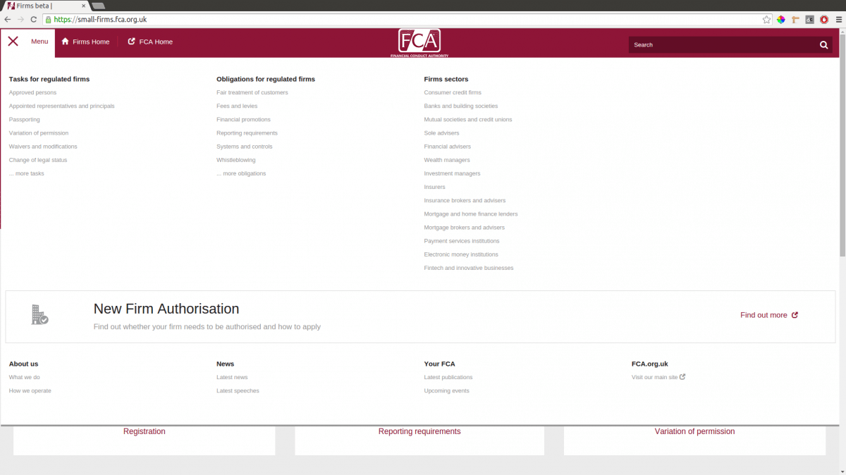
The perks of working on this theme was that I got the chance to implement a Mega Menu, which was suitable for the style of the site with a slightly more funky look:

Other info relating the front end of FCA:
The client! The FCA's in-house Editorial and Digital team were great to work with and were on call for scrums whenever need be. They weren't afraid to get stuck in with the content managing side of things as well as making good use of the megamenu and learning how to arrange, re-arrange and add links.
OVERALL:
After all the great effort from our team we are pleased to have worked with the FCA and feel that the sites are of top quality for their purposes. We have learned a lot about how multi-domain sites work and how the workflow can change quite a lot when working with different hosting services. The Small Firms "Beta" site is now up and running while very particular accessibility bugs are being cross checked for a solid build.

