User Experience & Web Design
Looking for top tier audience engagement? Creating an outstanding user experience is a telltale sign that you understand your user base and you’re willing to go the extra mile to accommodate them.
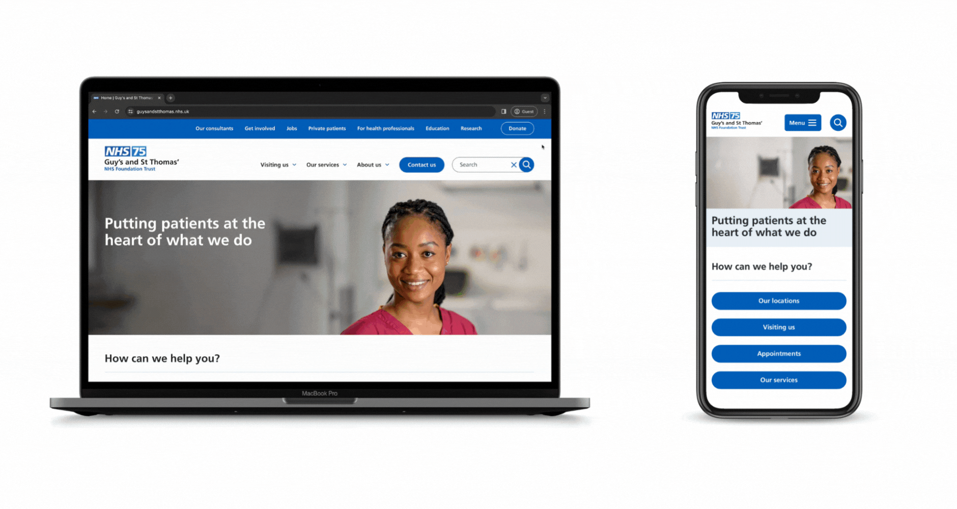
Luckily, Zoocha are experts in exactly how and why a page works, on every device. From user personas to information architecture, we’ll create successful designs that are perfect for both you and your audience.
Some of practices that make us the best in the game for UX and Design are:
- Mobile and responsive design
- Extensive user research
- Stakeholder engagement
- High-fidelity Figma prototypes across all devices
- WCAG 2.2 accessibility adherence delivered by IAAP members
Join our varied client base in receiving world-class user experience.
Working with you and your team, Zoocha will deliver an attractive, navigable site, with full compliance to accessibility standards at the forefront of our design process.
We work quickly yet efficiently to create a final platform that you can be proud to represent your organisation.
You’re in safe hands.
UX and Web Design related services are brought to you by certified IAAP members, with three decades of experience in our leadership.
Case studies


Certifications